Client: YouTube
Location: San Bruno, CA, United States
Completion date: 2018
Project Team
Principal Architect
Will Turner
Valerio Dewalt Train
Design Architect
Miles Stemper
Valerio Dewalt Train
Architectural Designer
Chandni Sheth
Valerio Dewalt Train
Studio Director
Crystal Adams
Media-Objectives
Designer
Noah Jeppson
Media-Objectives
Designer
Martyna Ziemba-Martinez
Media-Objectives
Digital Designer
Lane Rick
Office of Things
Digital Designer
Can Bui
Office of Things
Photography
Mariko Reed
Video
Francisco Lopez de Arenosa
Media-Objectives
Overview
The new YouTube Lobby is now more than a point of entry, it is a destination for entertaining guests, showcasing creators and inspiring visitors. After occupying a building that once housed the Gap
Goals
Having occupied a building in San Bruno, California that previously housed the Gap’s headquarters, YouTube quickly found that its lobby was in dire need of an update. Functionally, the existing space was congested and poor acoustics made it feel loud and chaotic. But equally important, the entrance to such an important tech company felt plain and didn’t reflect the creativity behind the platform nor its nearly 2 billion user base. For visitors, the lobby would likely be the only part of the company that they would be granted access to, and the experience had been perceived by many as anticlimactic.
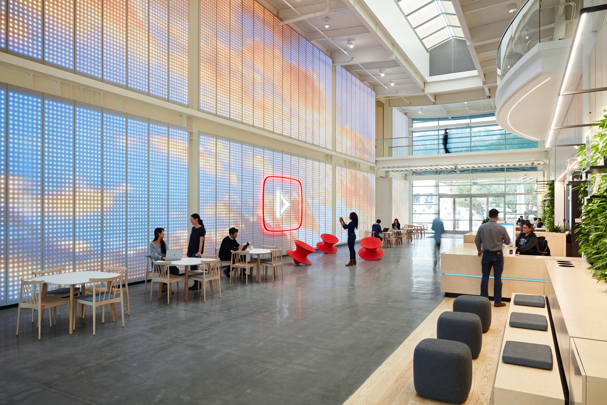
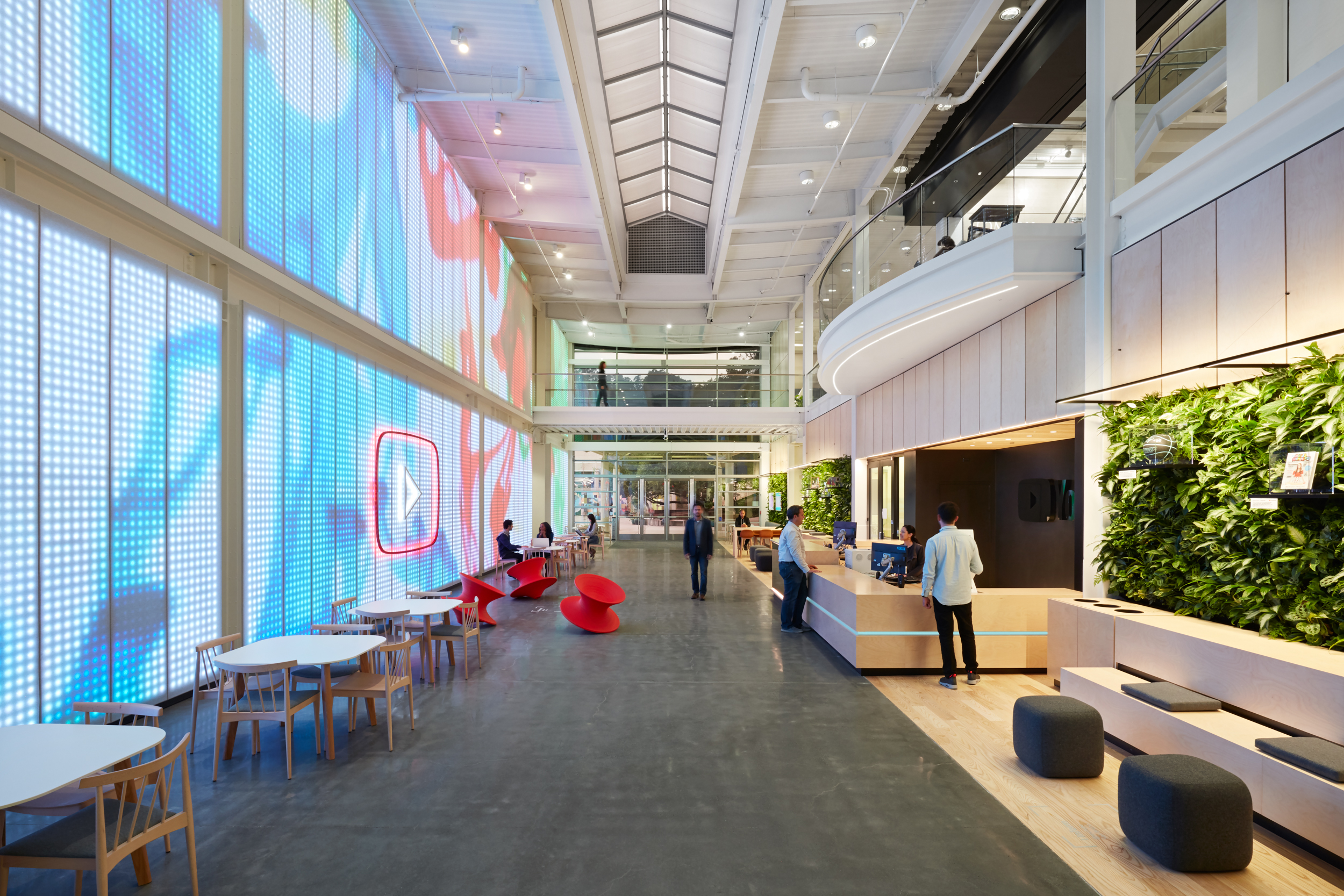
A series of visioning sessions with project stakeholders led to design principles that would dictate the outcome of the new lobby. First, was to create a striking experience, something memorable, that would inspire visitors and mark their arrival at the company headquarters. Second, integrate iconic and share-worthy branding to encourage user interaction with social media. Third, incorporate multipurpose functionality and optimal flow, so that the space could be used for events as well as for day-to-day work activities. Finally, to provide a canvas for creators, where visiting Youtubers could display their work at a grand scale.
Process
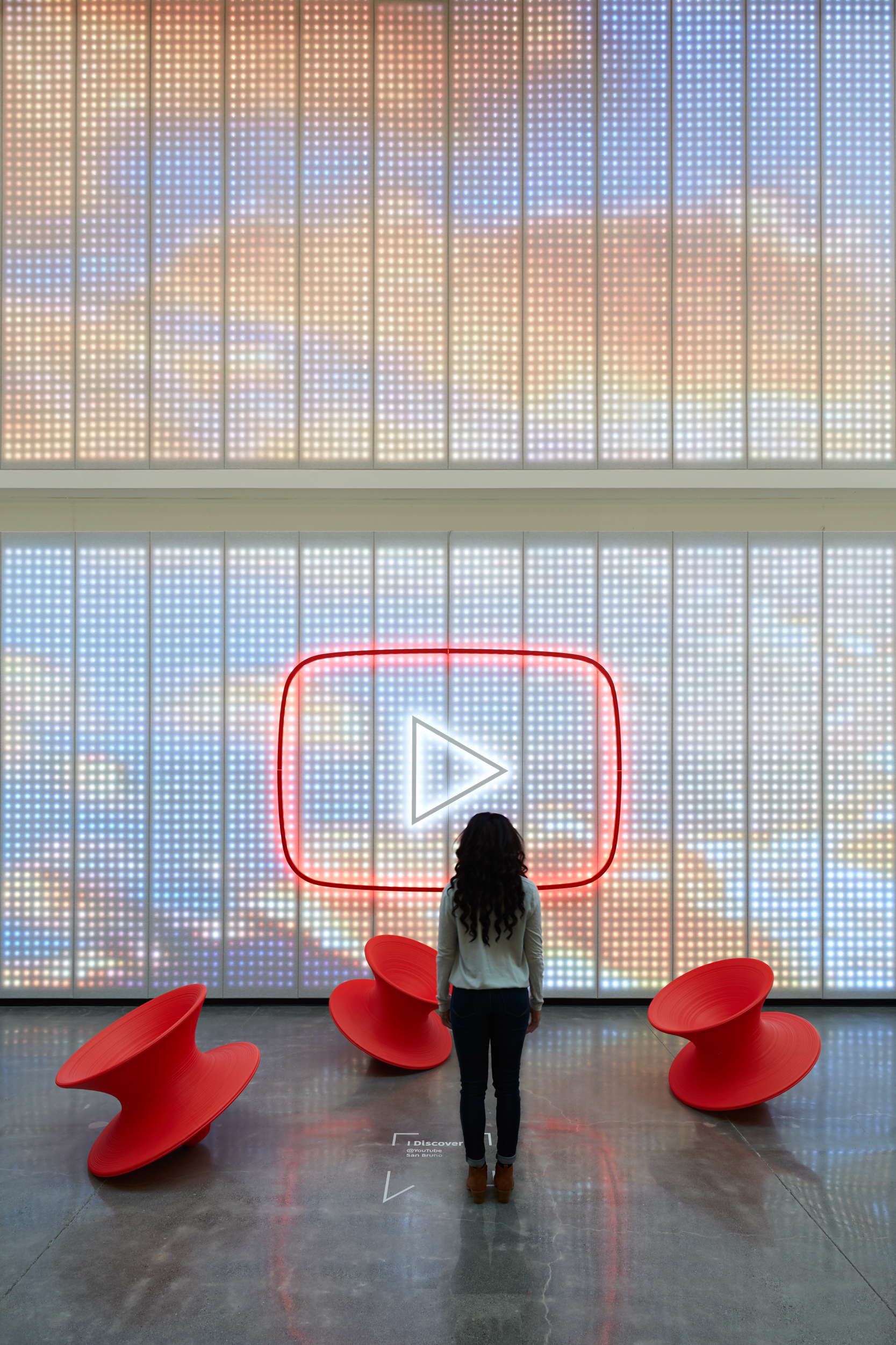
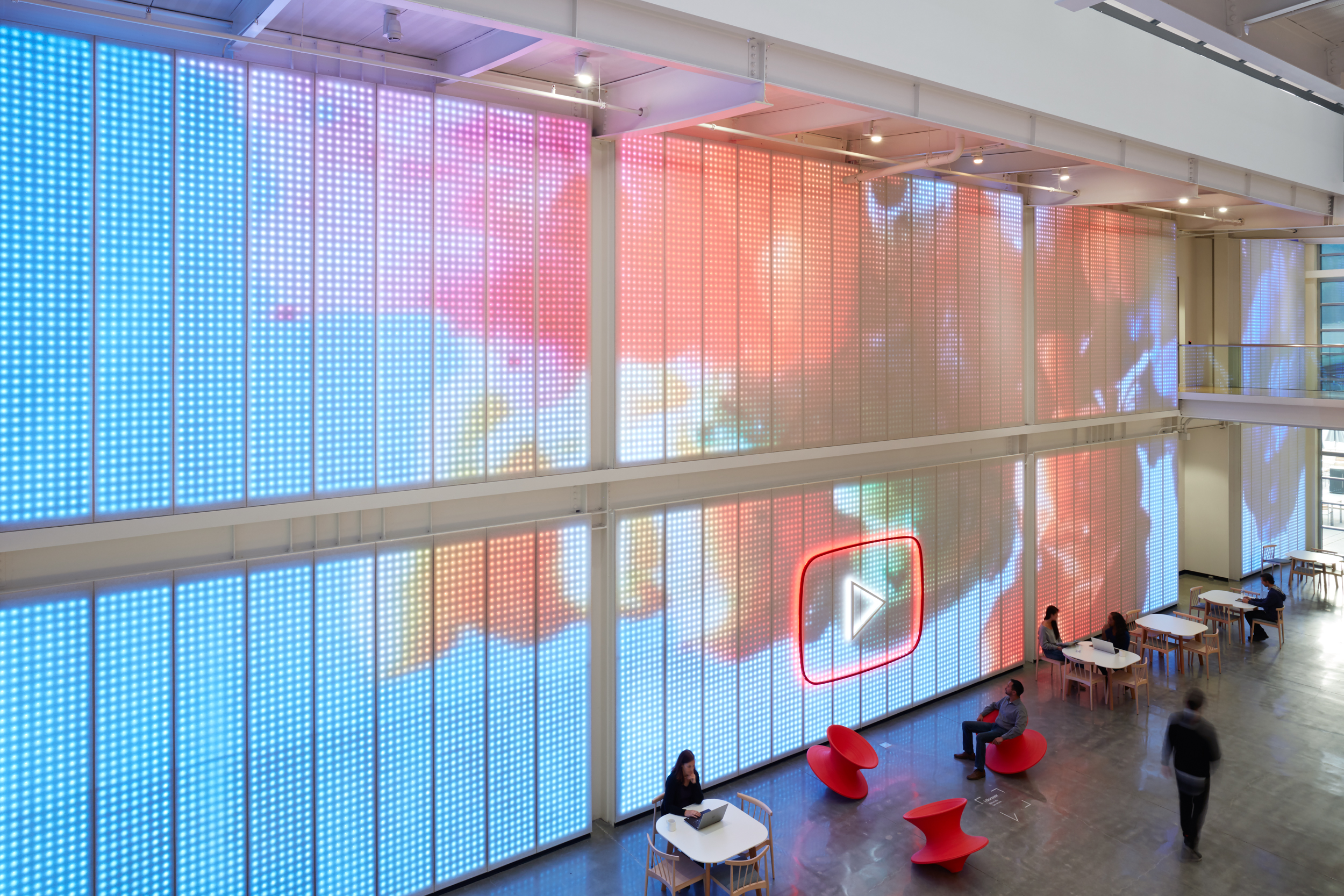
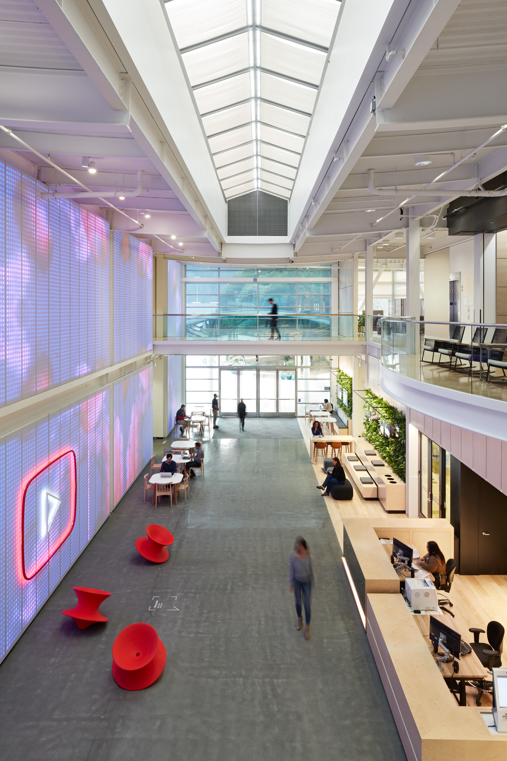
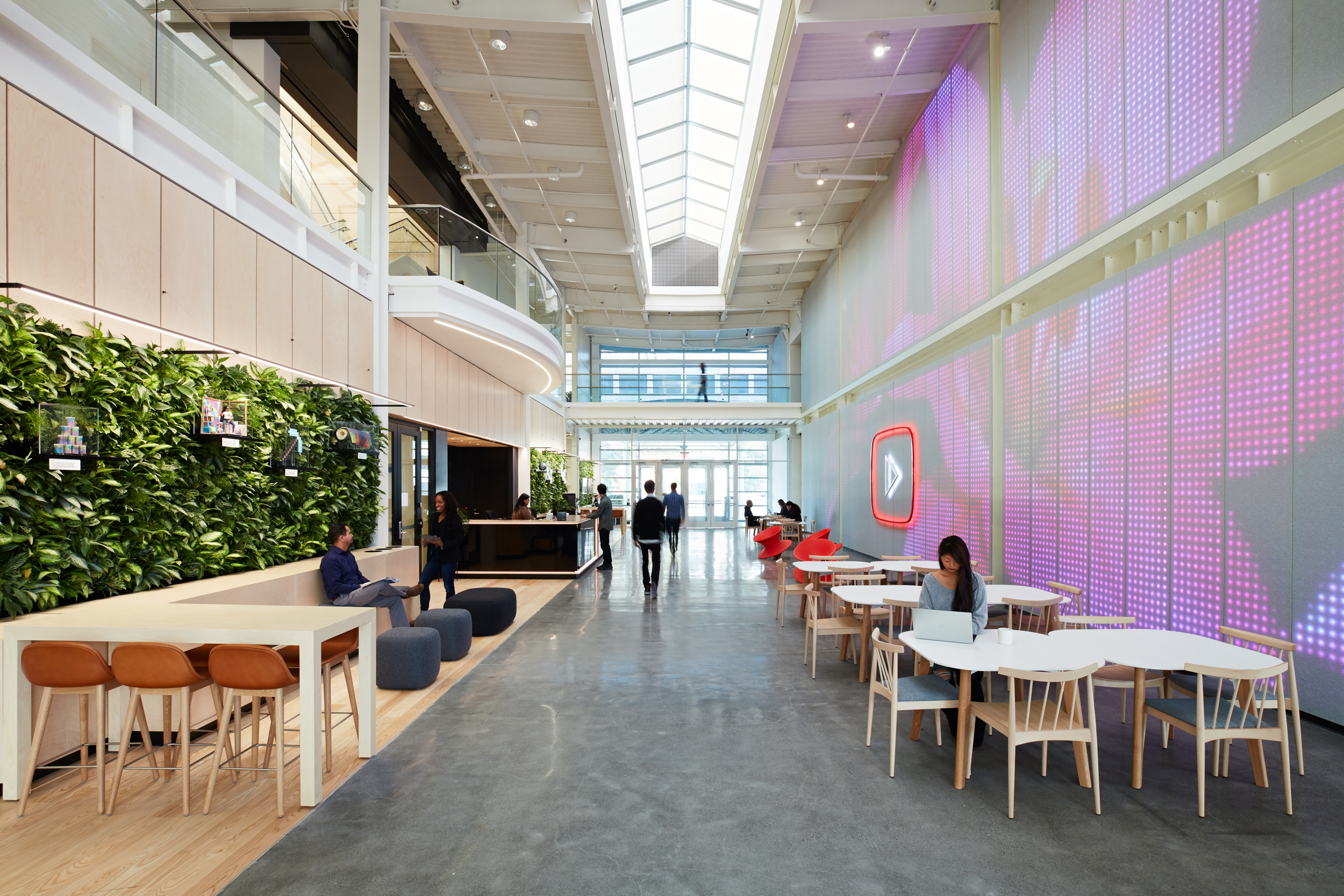
901 Cherry’s double-height atrium is now stripped down to its metallic structure, intersected by a long skylight that runs the length of the space. Upon entry, visitors are greeted with a floor-to-ceiling digital installation on the southern wall, neatly tucked between the building’s steel structure. Rather than add a cutting-edge high-resolution screen to display content, the designers treated the installation as an art piece, an abstraction of a screen that celebrates individual pixels. The LEDs that light the panels are broadly spaced and set a few inches behind a layer of soft acoustic fabric, so that the material catches the light as large circles. As a result, the videos that play on the screen take on an abstract, ephemeral quality. Unlike the cold plastic materials typically used in technological products, the soft fabric feels inviting and warm to the touch. When the LEDs are off, they’re invisible behind the fabric.
Additional Information
A series of floor “medallions” are spread throughout the lobby, encouraging visitors to interact with the digital installation. Each medallion bears a graphic that describes one of YouTube’s core values. Stepping on a medallion triggers a reaction on the digital wall. Activating multiple medallions in different combinations gets different responses, inviting visitors to work together on learn how the medallions function. Much like YouTube’s online platform, the lobby is designed to foster creativity, exploration, and discovery, all while celebrating the company’s content creators and employees alike.