Client: City of Walnut Creek, California
Location: Walnut Creek, CA, United States
Completion date: 2010
Artwork budget: $300,000
Project Team
Artist
Christian Moeller
Architect
Dawn Merkes AIA LEED
Group 4 Architecture Research + Planning, Inc.
Architect
Jill Eyres
Group 4 Architecture Research + Planning, Inc.
Interior Designer
Andrea Gifford RA LEED
Group 4 Architecture Research + Planning, Inc.
Overview
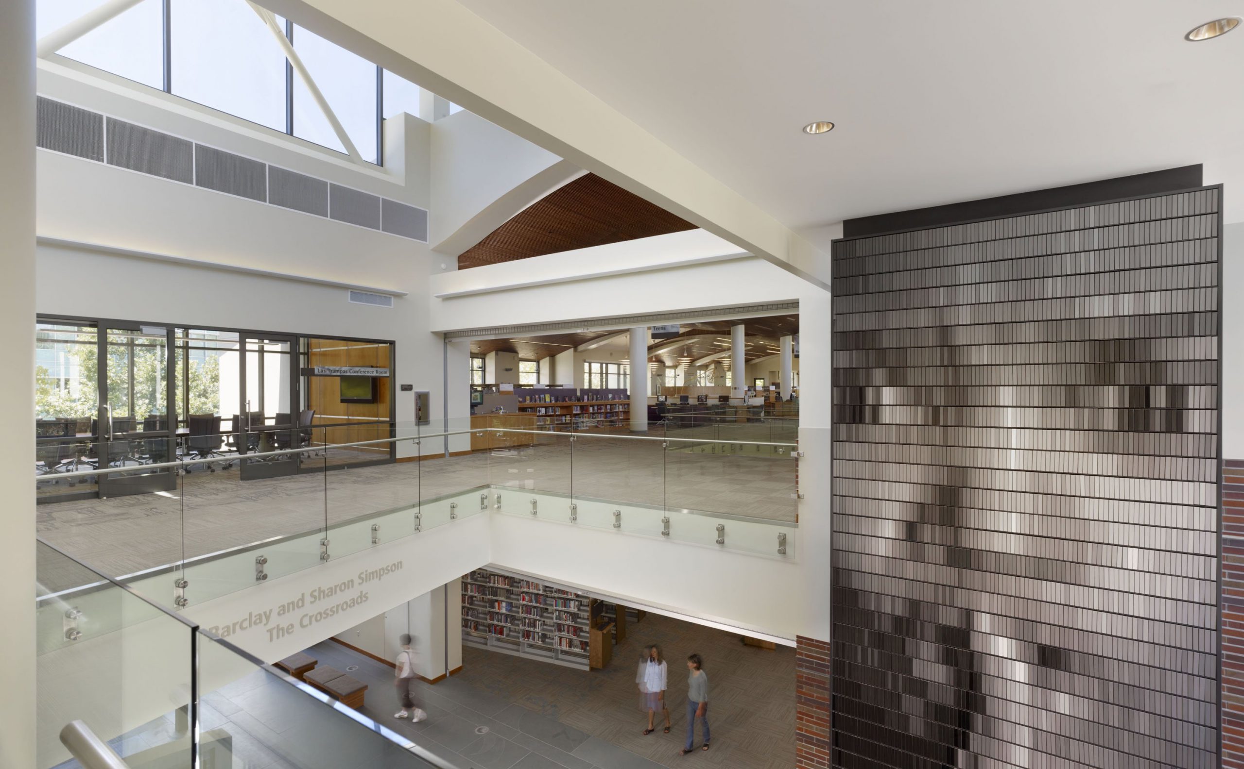
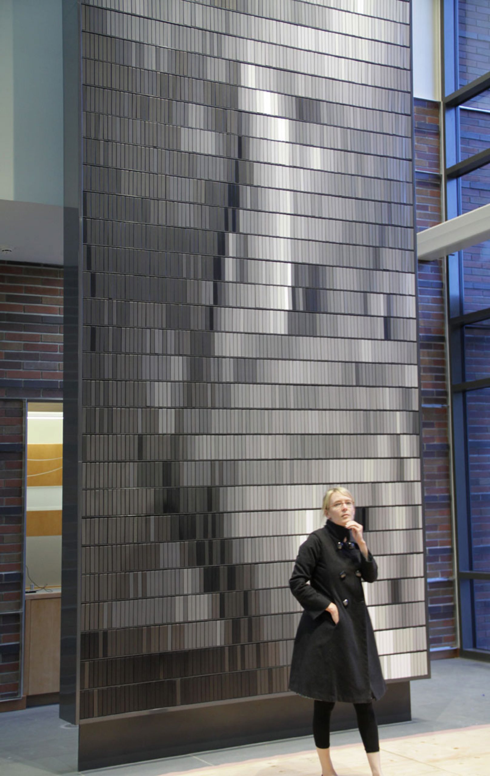
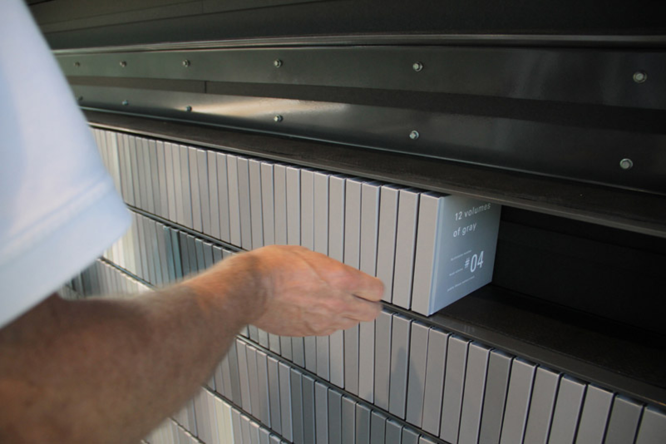
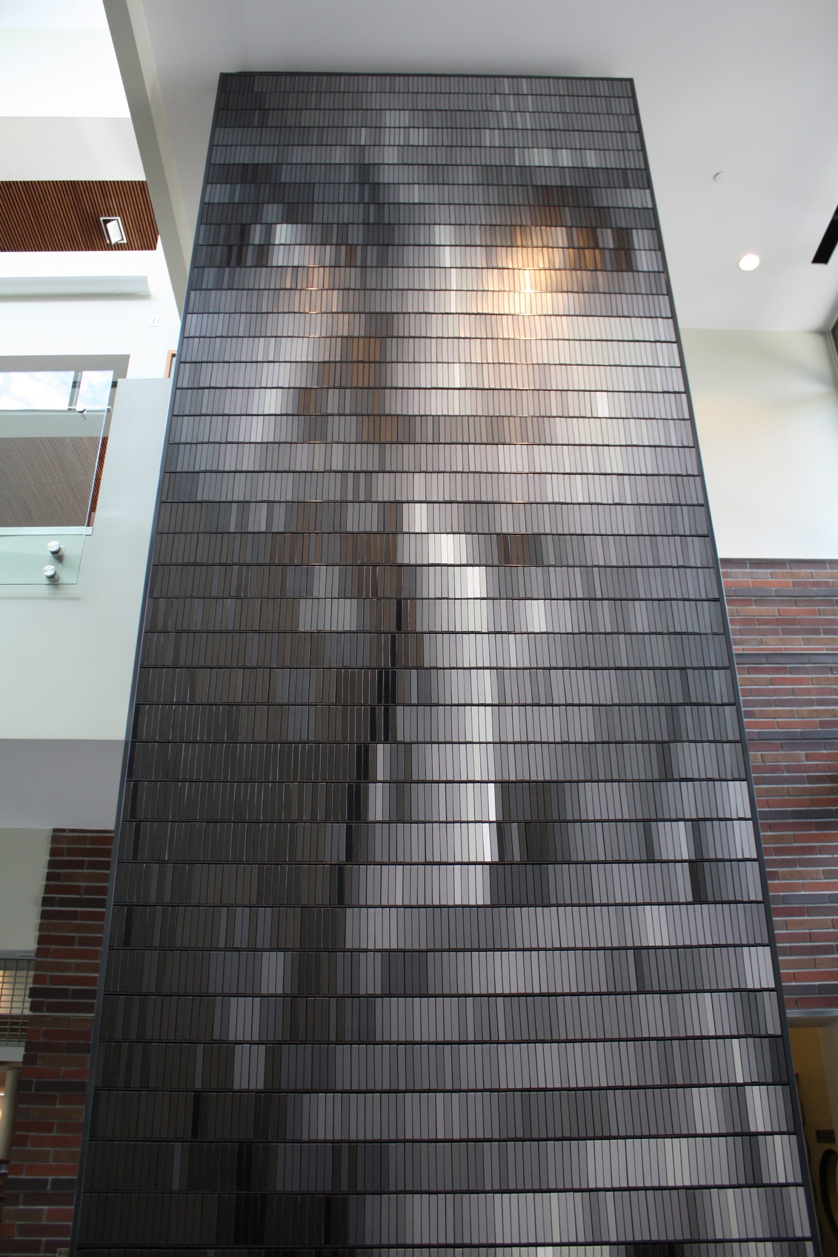
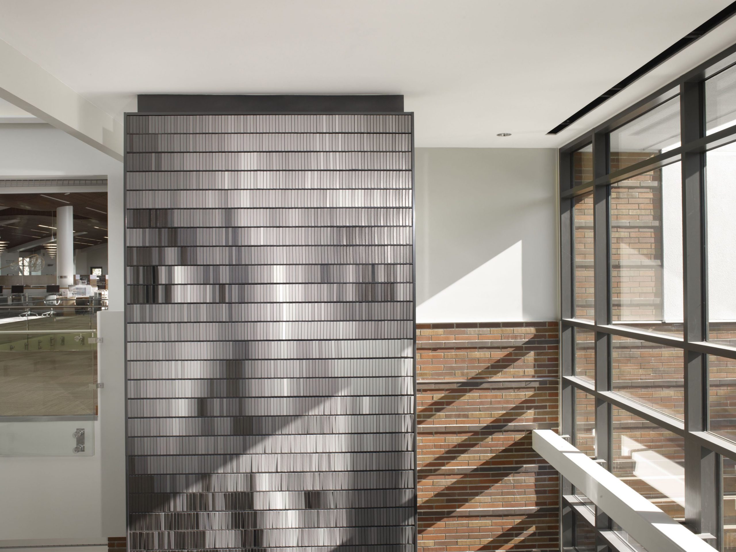
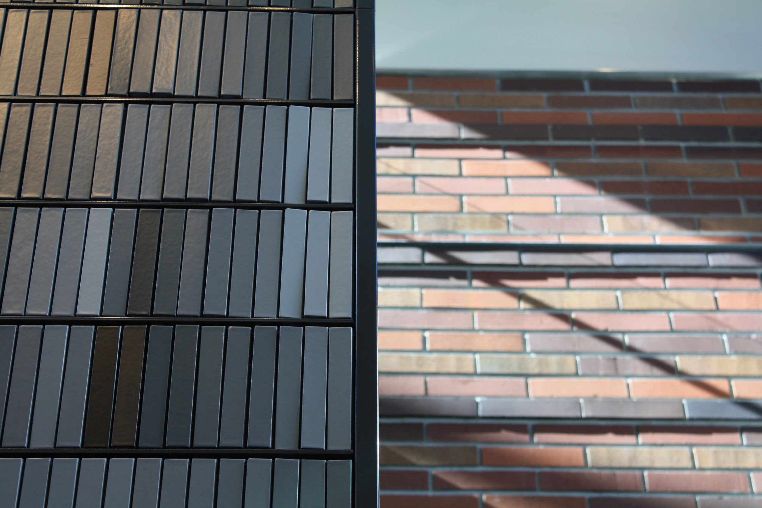
“12 Volumes of Gray” is a 26’ tall by 8’ wide bookshelf filled with more than 4,000 books – each bound in one of 12 shades of gray – that can be rearranged in different combinations over time. Standing in the central lobby of the Walnut Creek Library, the work can be seen from throughout the building inside and out. Its “pixelated” image reveals itself most clearly when viewed through a digital interface such as a smartphone. The massive composition engages the cultural institution of the traditional analog library while embracing the emerging paradigm of our digital information age.
Goals
The City of Walnut Creek commissioned the work early in the architectural design process. The artist sought to create a work that comments on the evolving merger of digital information media, analog books, and the physical space of the contemporary library.
“12 Volumes of Gray” was designed by Christian Moeller pecifically for the library’s grand lobby space and is well integrated with the building. Its scale within the space echoes the relationship between the library’s collection shelving and its architecture. Its orientation was orchestrated to maximize its visibility in the building without impacting circulation; in fact, the work is an important wayfinding landmark as well as a source of wonder and delight. Although the work’s scale and presence is significant, the whimsy of the pixelated image of a librarian with a finger to her lips imparts a playfulness that has become an integral part of the library’s modern “brand” identity.
The structural requirements of the work and the logistics of its fabrication and installation required very early coordination and collaboration with the building’s design team. The shelves are specially designed to prevent books from falling in an earthquake.
Process
Moeller originally proposed using book spines as pixels in a very large bookshelf. As well as the initial image, he proposed additional images that would be revealed by rearranging books according to a coded matrix. Rather than building extra storage for the significant surplus inventory of books needed to create the alternate images, the artist, library staff, and design team collaboratively developed an alternate solution – storing the extra books on the library’s shelves as part of its collection. With the surplus books distributed throughout the building, the artwork reaches beyond the library lobby, strengthening the impact of its statement.
The logistics of changing the images in the future presented a challenge solved through creative dialogue and collaboration between the artist, the library, and the community. In a program that will be managed by Friends of the Library volunteers, community members may buy blank gray volumes, write in them, and return them to the inventory. Eventually, the bookshelf will be filled with the community’s sketches, stories, and ideas. Wherever the books go in the community, they carry with them the imprint of the artwork – and then they transport the community’s unique identity back to the library.