Client: Hubei Xiang Sheng Yin Xing Entertainment Management Co., Ltd.
Location: Wuhan, China
Completion date: 2017
Artwork budget: $2,400,000
Project Team
Interior Designer
Virginia Lung
One Plus Partnership Limited
Client
Hubei Xiang Sheng Yin Xing Entertainment Management Co., Ltd.
Hubei Xiang Sheng Yin Xing Entertainment Management Co., Ltd.
Overview
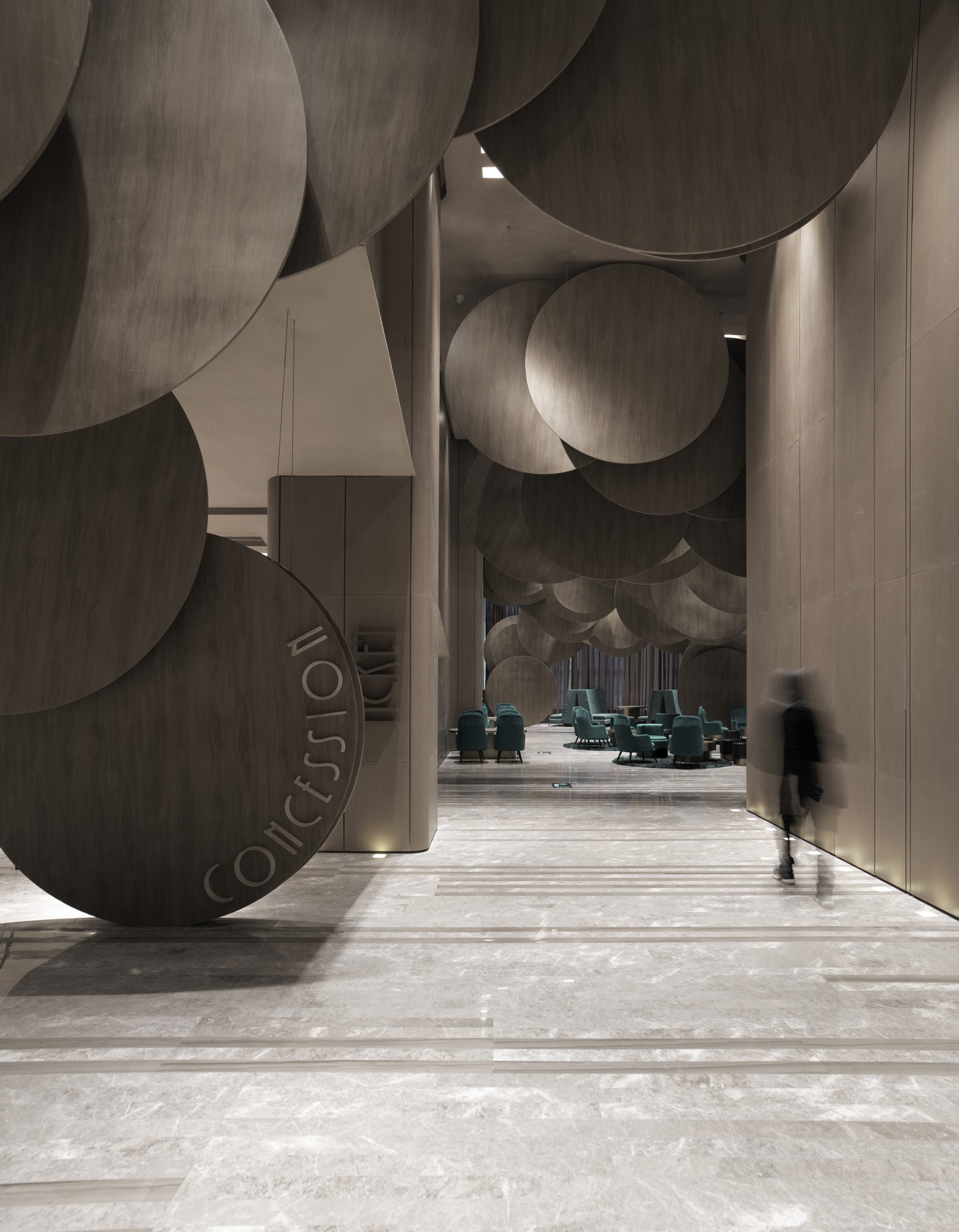
This project is an extension of the cinema downstairs, also designed by us 7 years ago. The client did not provide any briefs, but the designers created a design that contrasts with the brand’s cinema downstairs. With the rotating motion of film reels as the design theme, this elegant and artistic cinema is very different from the cinema downstairs, which has a high-tech and modernistic theme of pixels. The difference between the color scheme used in the 2 cinemas, and contrasting round and square forms leads to a refreshing image for this cinema extension.
Goals
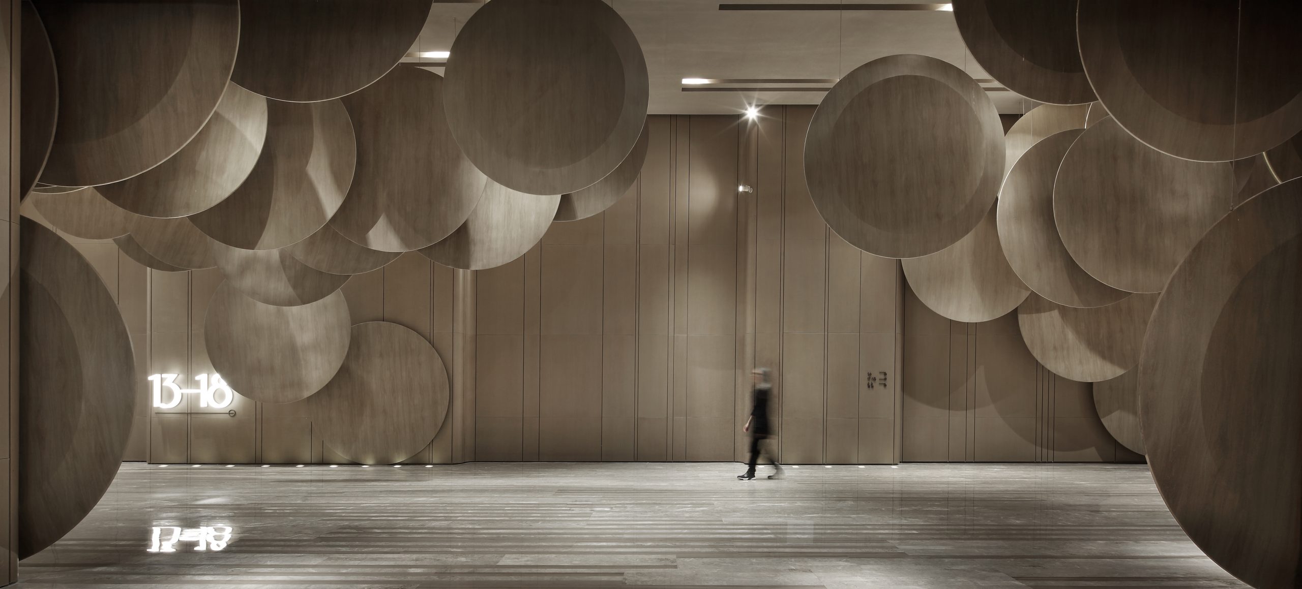
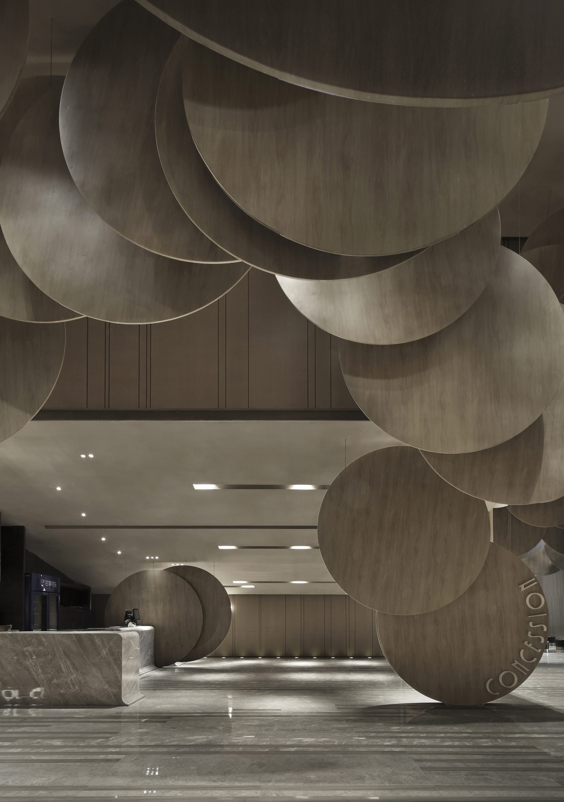
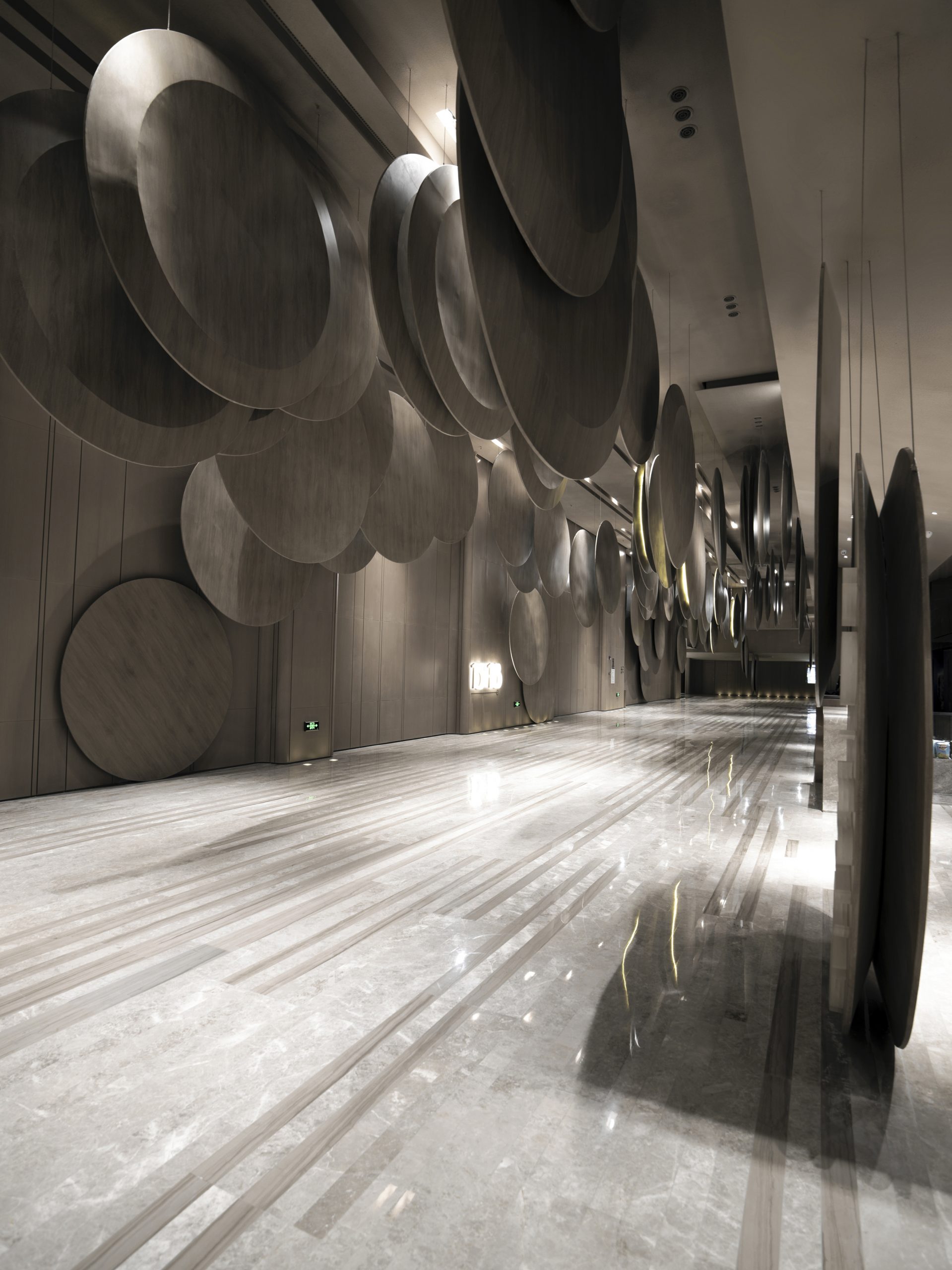
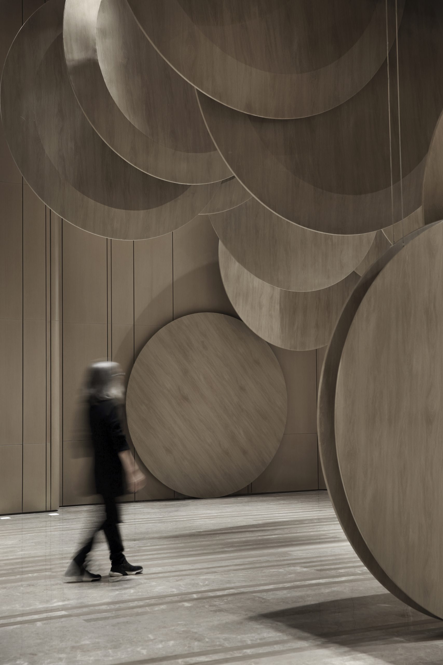
The designers strive to incorporate artwork as part of interior design. The creation of artwork not only decorates the space, but illustrates a theme that is evident throughout the cinema. As the audience enter the lobby, they will be struck by round plates arranged all across the ceiling. Film reels are portrayed as huge round plates with 2.8 meter diameter, which are linked carefully by designers, jointly form an enormous and powerful ceiling feature. These decorations represent the rotating motion of the reels, captured and portrayed in an impactful and modernistic movie-viewing environment.
The theme is also portrayed through the designer’s creation of ceiling and wall decorations in the auditorium. The ceiling and walls are all covered with small brown discs made from sound absorbing panels, echoing with the ceiling feature in the lobby. The discs seem to be flying towards the audience from everywhere, creating a sense of speed and excitement. The theme of rolling reels extends into the washroom, which is represented by the big copper colored plate at the hand wash basin. By morphing artwork into facilities, the audience can not only appreciate the artistic decorations, but actually get into close contact with the art pieces.
Process
Round shapes are usually used as patterns in interior design, but the designers have adopted an innovative expression of round shapes in this project. They accentuated the theme of rotating film reels by using full circle as the dominant visual element, illustrated through huge round plates in the ceiling feature. Full circle is a design element that is difficult to handle, with more limitations in the material and form of expression. Especially with a male-dominant client, it was harder for them to accept round shape as central design element, which would easily be deemed fancy, young and feminine, as they prefer more masculine form and color. It was challenging to optimally demonstrate a sense of elegance in the form of full circles.
Despite the use of large amount of round shapes in the cinema design, with careful choice of materials and arrangement of these circular elements, the designers have successfully created an elegant and stylish atmosphere. This modernistic application of circular installations have received very positive feedbacks from the audience and media, as this rarely seen expression of round shapes strikingly translates into a grand interior.
Additional Information
As the space was originally a restaurant, it was not designed to be a cinema, the loading was thus insufficient to install these heavy and enormous round plates as ceiling feature. The designers had to think of alternatives of creating the similar effect with a smaller loading. The originally larger round plates with 3 meter diameter had to be smaller and thinner to reduce the weight. It was inevitable for the round plates to be less densely distributed, the designers have arranged them to overlap each other in various heights, adding volume and three-dimensional effect to the ceiling feature.